7th January 2026 - 5 mins read
Safezones and Subtitles: Guidelines every creator should follow
You can have the best video in the world, but if the text gets cut off or subtitles sit under UI elements, it falls apart fast. Safe zones and subtitles sound boring, but left unchecked, they affect your content negatively.
These guidelines exist to avoid that. Use this checklist to know exactly where text should live and how subtitles should work.
Safe zones
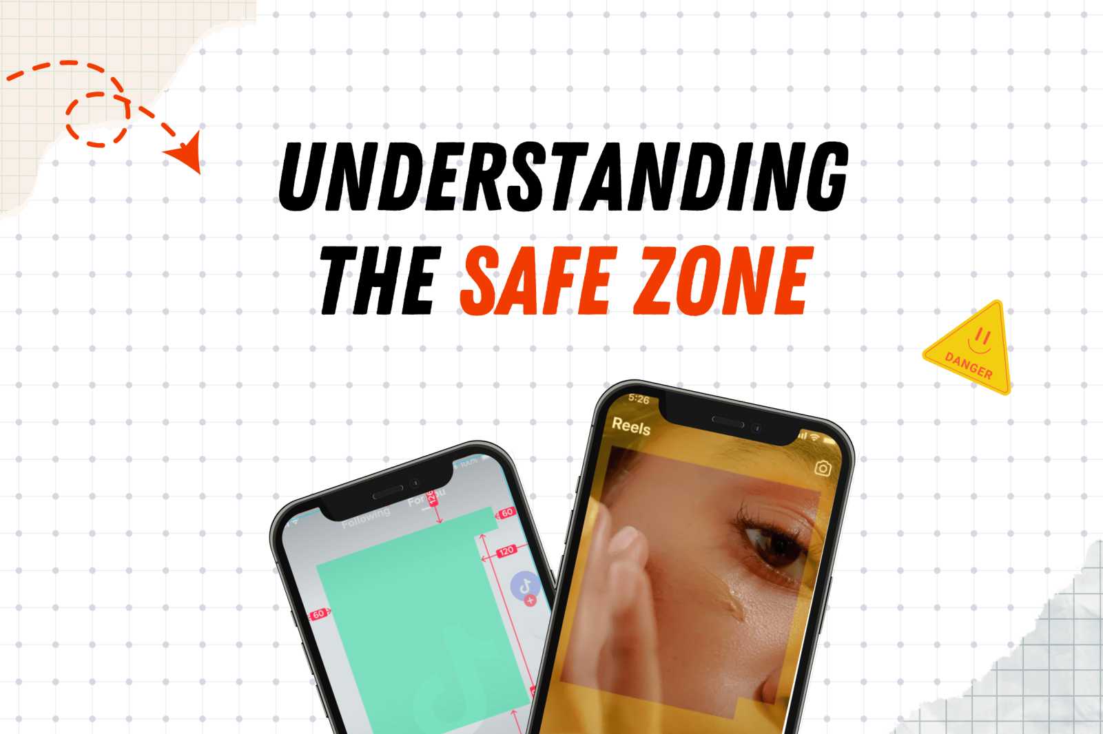
When you deliver a video, you’re not delivering the final version users will see. Platforms like TikTok and Instagram add their own interface elements on top of your video: captions, buttons, icons, and sometimes download or call-to-action cards.
That’s why safe zones matter. They protect your content from getting covered later.
The rule is simple: All important elements (text, logos, icons, disclaimers) must stay inside the safe zone.
If it’s important, keep it centered.
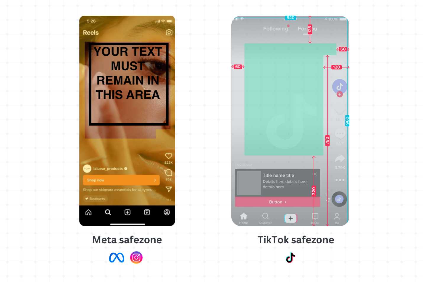
What platforms/advertisers usually add on top of your video
After your video is uploaded, platforms may add:
- Captions and usernames near the bottom
- Buttons or call-to-action elements in the lower third
- Profile icons or UI elements along the sides
- Additional interactive elements, depending on the format
You won’t control these elements as a creator but you can design around them.
PS: You can use this tool to check your safe zones!It will guide you for Instagram, TikTok, and YouTube. Simply upload an image or a video and see what areas are safe for full visibility.
Subtitles
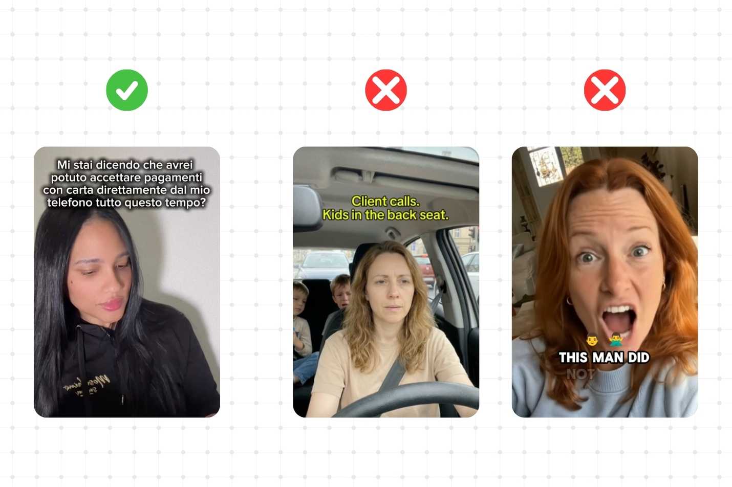
Subtitles are required on most videos. They must be easy to read, platform-native, and placed safely so nothing gets covered by UI. If subtitles are hard to read or styled incorrectly, the video loses its appeal even if everything else is perfect.
Subtitle accuracy matters, which means subtitles should match the spoken words exactly. Avoid paraphrasing or summarizing; word-for-word captions keep the video clear and trustworthy.
Subtitles must stay inside the safe zone. Do not place them at the very bottom of the frame. Leave space below subtitles for captions, buttons, or UI. If subtitles touch the bottom edge, they will get covered.
Styles
Go for native TikTok-style subtitles like the classic white text, black outline in a clean and simple font. This style feels familiar, readable, and native to the platform. But also remember that while this style is a strong and reliable standard, it is not the only one that works. Feel free to experiment with different formats as long as they are high-quality, easily readable, and clean.
What to avoid
Do not use:
- Big yellow or neon text
- Too small or too oversized (unless the style demands variation)
- Emojis added after every sentence or layered on top of subtitles
- One word per line with a full stop after every word (e.g. this. is. not. okay.)
These styles don’t feel native and break the viewing experience.
.jpg)

.png)


.png)

.png)